
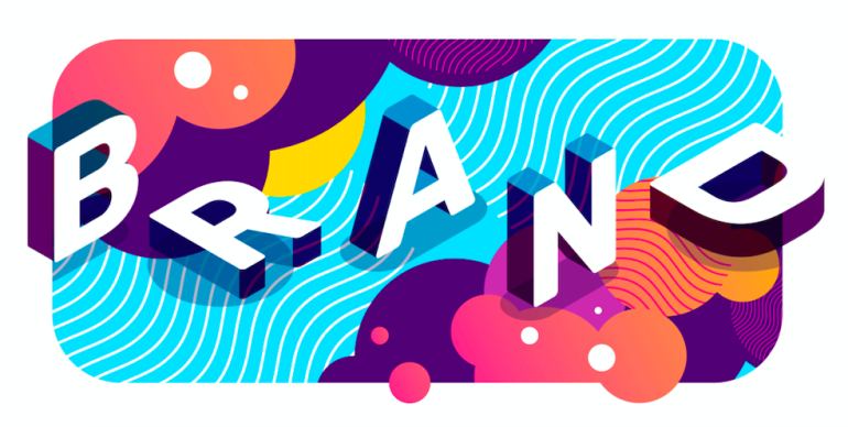
Crafting Your Brand Identity: The Art of Selecting Colors Wisely
In the vast landscape of branding, crafting a strong and impactful brand identity is crucial for any business seeking to establish a lasting presence in the minds of consumers. Among the myriad elements that shape a brand's identity, the choice of colors holds tremendous significance. Colors have the remarkable ability to evoke emotions, convey meaning, and create immediate connections with an audience. This is why it is so important to understand the importance of selecting colors wisely to create a cohesive and powerful brand image. From understanding how colors can effectively communicate your brand's personality, values, and mission to exploring real-world examples of successful branding palettes, we will provide expert insights and tips to guide you in making informed decisions when it comes to coloring your brand identity. Whether you are rebranding or starting from scratch, this blog aims to equip you with the knowledge to craft a memorable and impactful brand identity that resonates with your target audience on a deeper level.
The Language of Colors in Branding
Colors are a language of their own in the realm of branding. Each color holds a unique set of meanings and associations that can trigger emotional responses in consumers. The psychological impact of color can influence how a brand is perceived, creating lasting impressions that shape consumer decisions and loyalty.
For example, the color blue is often associated with qualities such as trust, reliability, and professionalism. Brands like IBM and American Express have strategically utilized blue to evoke a sense of stability and credibility in their brand identities. On the other hand, brands like Coca-Cola and Red Bull have adopted the color red to evoke feelings of energy, excitement, and passion, appealing to consumers seeking exhilarating experiences.
Conveying Brand Personality Through Colors
One of the primary objectives of selecting colors for your brand identity is to effectively convey your brand's personality. Your brand personality encompasses the characteristics, values, and traits that define your brand's essence and connect with your target audience. When you align your color choices with your brand personality, you create a consistent and cohesive visual representation of your brand.
For instance, if your brand personality is youthful, adventurous, and vibrant, you may consider using bold and energetic colors like orange or yellow. Conversely, if your brand personality is sophisticated, elegant, and refined, a more subdued and classic color palette, such as black and gold, may be appropriate.
The Role of Color in Communicating Brand Values and Mission
Beyond conveying brand personality, colors also play a vital role in communicating brand values and mission. Certain colors can be associated with specific industries or causes, helping your audience understand your brand's core principles at a glance. Examples and inspiration for colour schemes on brands can be found in the portfolio.
For example, green is commonly associated with nature, health, and sustainability. Brands in the organic food industry or eco-friendly products often incorporate green into their brand identities to communicate their commitment to environmental responsibility.
Similarly, brands with a focus on innovation and technology often use clean and futuristic colors like white and silver, reflecting their dedication to cutting-edge solutions and advancement.
Creating Cohesion: Combining Colors Effectively
Selecting individual colors is just the first step; creating a cohesive and harmonious color palette is equally important. Combining colors effectively is essential to avoid a visually cluttered or confusing brand identity.
Consider using color psychology to guide your color combinations. For example, complementary colors (those opposite each other on the color wheel) create dynamic and visually striking contrasts. Analogous colors (those adjacent on the color wheel) create a more harmonious and calming effect.
The balance between primary and secondary colors also contributes to visual harmony. Utilize a dominant color as the primary hue for your brand identity and complement it with secondary and accent colors to add depth and versatility to your design elements.
Real-World Examples: Successful Branding Palettes
Let's explore some real-world examples of brands that have effectively utilized color to craft memorable brand identities:
- Nike: Nike's iconic "Swoosh" logo is paired with a bold black color, evoking a sense of strength, determination, and athleticism. The timeless combination of black and white creates a visually powerful and enduring brand image.
- Starbucks: The green color palette of Starbucks reflects the brand's commitment to environmental sustainability and its connection to nature. This association aligns with their focus on ethically sourced coffee beans and environmentally conscious practices.
- FedEx: FedEx's bold combination of purple and orange symbolizes a sense of innovation and dependability in the logistics industry. The juxtaposition of these complementary colors creates a visually memorable logo that stands out among competitors.
Color Psychology in Action: Creating Memorable Brand Experiences
In conclusion, selecting colors wisely is an artful and strategic process in crafting a brand identity that resonates with your target audience. Understanding the language of colors and their psychological impact empowers brands to evoke specific emotions, convey personality, and communicate values and mission effectively. Combining colors harmoniously create a cohesive and memorable brand identity that captures the hearts and minds of consumers.
As you embark on the journey of coloring your brand identity, consider the power of color psychology and how it can transform your brand's presence in a competitive market. From evoking emotions to communicating your brand's essence, the art of selecting colors wisely is a powerful tool that can set your brand apart and foster lasting connections with your audience. Embrace the palette of possibilities, and watch as your brand identity becomes a captivating visual language that speaks to the hearts of consumers, driving your brand to new heights of success.

Leave a comment
Make sure you enter all the required information, indicated by an asterisk (*). HTML code is not allowed.